Available Widgets
Compass
The Compass widget belongs to the “single instant measure” category. It displays the latest value for a particular Property expressing a direction or angle. The widget will periodically interrogate the server to get the latest value.
Mandatory inputs are:
- “service”, “offering”, “feature” and “property”: selects a particular property to be shown. Property should take values between 0 and 360 (unit of measure is supposed to be degrees).
- “refresh_interval” (in seconds): is the time between updates (launches successive getObservations every Nth second).
Other optional inputs:
- “title”: If not specified, defaults to the name of the Feature.
- “display_utc_times”: The SOS service dates are in UTC, and they are converted to local time fuse by default. To display them in UTC, set this parameter to true.
- “footnote”: Optional small text caption at the bottom.
- “custom_css_url”: css stylesheet to be applied to the widget.
Gauge
Another “single instant measure”, but for percentage values ranging 0 to 100.
Mandatory inputs are:
- “service”, “offering”, “feature” and “property”: selects a particular property to be shown. Property should take values between 0 and 100 (unit of measure is supposed to be %).
- “refresh_interval” (in seconds): is the time between updates (launches successive getObservations every Nth second).
Other optional inputs:
- “footnote”: Optional small text caption at the bottom.
- “display_utc_times”: The SOS service dates are in UTC, and they are converted to local time fuse by default. To display them in UTC, set this parameter to true.
- “custom_css_url”: css stylesheet to be applied to the widget.
Jqgrid
It displays a jqGrid table, with a collection of observations for a given period of time, each row being an observation. Results are paginated and can be sorted by any column value (Result time, Feature name, Property Name, Value and Unit of Measure).
Mandatory inputs:
- “service”, “offering”, a collection of “features” and a collection of “properties”: selects a collection of feature-property combinations to be shown.
- “time_start” and “time_end”: The result time range of the observations to be displayed.
- “title”: the widget title.
Other optional inputs:
- “footnote”: Optional small text caption at the bottom.
- “display_utc_times”: The SOS service dates are in UTC, and they are converted to local time fuse by default. To display them in UTC, set this parameter to true.
- “custom_css_url”: css stylesheet to be applied to the widget. Please note that jqGrid look & feel is taken from the underlying jQuery-ui theme.
Note
this widget depends on jQuery, jQuery UI and the jgGrid plugin itself. It’s a rather heavy and not much customizable (it was made as an integration exercise with a legacy application). We recommend the use of other widgets such as the “table” one, which is more in the spirit of Sensor Widgets: lightweight, compact and easily customizable.
Map
This widget is special in many senses. First off, it represents a GetFeatureOfInterest response, instead of the most usual GetObservation response.
Sencondly, it is a highly customizable widget, with a lot of configuration options. Fortunately most of the inputs are optional, so its basic usage is in fact very simple.
It is built on the Leaflet mapping library.
The only strictly mandatory parameters are:
- “service” and “offering”: Determines the offering whose Features of Interest are to be displayed on a map.
This will display a map with the Features on it. Placing the mouse pointer over the map features will display a little tooltip with the feature name.
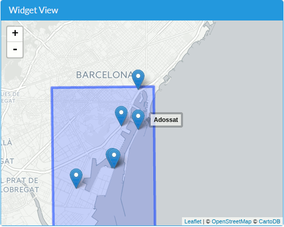
Simple map with no features and no properties indicated.
There are another couple of mandatory (but not so mandatory) inputs:
- “features”: One can select which features to display. If none is selected, all of the possible features are displayed (no filtering aplied). But you have to explicitly indicate an empty array of features as input.
- “properties”: If one or more properties are selected, each feature’s tooltip will be an embedded panel widget, displaying the list of properties. Again, you can indicate an empty array of properties. In this case, no property values are shown.
Simple map with four features and one property selected.
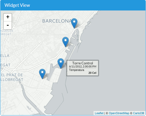
The “permanent_tooltips” optional parameter, if set to “true”, will force the tooltips to be always shown, not only on mouse hover.
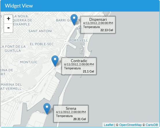
Map with permanent tooltips.
If map elements appear located in the opposite side of the world, you probably have to change the coordinate axis order. Setting the optional parameter “swap_axis”=true, latitude and longitude will be switched, and this effect will be fixed.
Besides the tooltip, we can also attach a sub-widget to each feature, which will be displayed when clicking the feature. The “popup_widget” input is a JSON structure which contains a Widget definition. The “service”, “offering” and “feature(s)” inputs for the widget are taken from the parent map widget, so are not needed. The “name” property indicates which widget to be instantiated.
For instance, if we want to open a popup containing a “timechart” on each feature click, we have to indicate:
- “name”: “timechart”,
- ...all the timechart widget inputs, except for “service” and “offering”.
That is:
{
    "name": "timechart",
    "title": "Temperatures",
    "properties": [
        "http://sensors.portdebarcelona.cat/def/weather/properties#32M",
        "http://sensors.portdebarcelona.cat/def/weather/properties#32",
        "http://sensors.portdebarcelona.cat/def/weather/properties#32N"
    ],
    "time_start": "2015-09-03T05:05:40Z",
    "time_end": "2015-09-03T08:05:40Z"
}
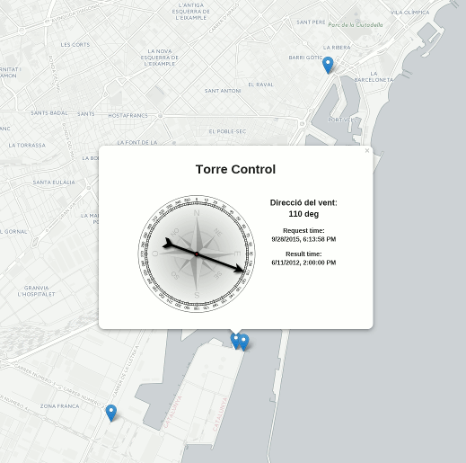
Map with a “compass” popup.
Apart from customizing both tooltips and popups with details about each feature, we can indicate a custom base layer for the map, via the “base_layer” input. Two layer types can be specified:
A Tile layer: Specify an “url”, and a collection of “options”. For example:
{ "url": "http://{s}.tile.openstreetmap.org/{z}/{x}/{y}.png", "options": { "maxZoom": 19, "attribution": "© <a href='http://www.openstreetmap.org/copyright'>OpenStreetMap contributors</a>" } }
The “url” and “options” parameters correspond to Leaflet’s TileLayer “urlTemplate” and “TileLayer_options” respectively.
There’s a good collection of free tile layers here: http://leaflet-extras.github.io/leaflet-providers/preview/
A WMS layer: Specify “type”: “wms”, an “url” and a collection of “options”. For example:
{
   "type": "wms",
   "url": "http://geoserveis.icc.cat/icc_mapesbase/wms/service",
   "options": {
      "layers": "orto5m",
      "format": "image/jpeg",
      "attribution": "Ortofoto 1:5.000: CC-by <a href='http://www.icc.cat' target='_blank'>Institut Cartogràfic de Catalunya</a>"
   }
}
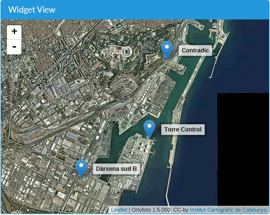
Map with a custom base WMS layer.
The “url” and “options” parameters correspond to Leaflet’s TileLayer.WMS “baseUrl” and “TileLayer.WMS_options” respectively.
Another optional input is “max_initial_zoom”: It indicates the maximum zoom level to use when the map is first rendered. This avoids to zoom in too much, so we loose context, especially when a single point feature is drawn.
When there is a risk of marker overlapping on the map, a clustering mechanism is applied automatically. This automatic clustering can be disabled setting to true the optional “no_clustering” parameter.
If creating the widget with Javascript, it is possible to capture the “click” event on a map marker and get its details:
"on_click": function(marker) {
   console.log(marker.feature);
}
Finally, the common “display_utc_times”, “footnote” and “custom_css_url” inputs are also available.
See a complete live example here: http://bl.ocks.org/oscarfonts/265d734349396cf4372c
Panel
The “panel” widget is used to display all (or some of) the last property values for a particular Feature. It is built as an HTML Definition List, compatible with Bootstrap CSS classes. The widget will auto-refresh periodically.
Its mandatory inputs are:
- The usual “service”, “offering” and “feature”.
- A list of “properties” to be displayed.
- The “refresh_interval”, in seconds.
And the optional inputs: “title”, “display_utc_times”, “footnote” and “custom_css_url”.
The panel will show the result time as a subtitle. In case some of the propertie’s result time is previous to the common one, the value will be displayed in red and the particular result time for that observation displayed explicitly.
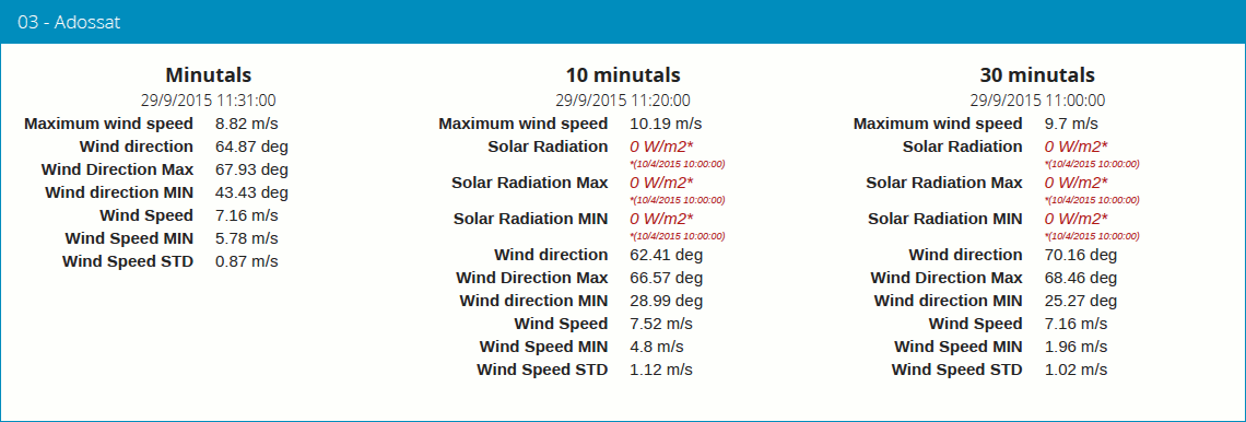
Three Panel widgets, some of them showing outdated values.
Progressbar
Another instant measure widget, this time displayed as a proportion bar between two values. It is useful to show how a value relates to its boundary values. It can be used to display a percentage if min/max values ranging from 0 to 100, but it could also be used to display a liquid level, or a pressure. Sort of a “gauge” but displayed linearly and with custom value range.
Its mandatory inputs:
- The usual “service”, “offering”, “feature” and “property”.
- “min_value” and “max_value”, which will determine the extreme values.
- “refresh_interval” in seconds.
And the usual optional inputs: “display_utc_times”, “footnote” and “custom_css_url”.
Status
The “status” widget displays the whole offering status at a glance. Given an offering, it builds a table with all the possible feature-property combinations, and for each one, the last observed value and its recency. It is a good way to see the offering’s health: If new data is being generated and for which sensors.
This widget is meant as a monitoring tool (sort of hypertable), and it’s better displayed at full screen.
Its only mandatory inputs are “service” and “offering”.
And the common optional inputs: “display_utc_times”, “footnote” and “custom_css_url”.
Table
Given a feature and a time range, the table displays property values over a time period. It provides a more compact view than jqGrid widget. The widget is built as a plain HTML table supporting Bootstrap’s styling.
- The usual “service”, “offering” and “feature”.
- A list of “properties” to be displayed.
- “time_start” and “time_end”: The result time range of the observations to be displayed.
- The table’s “title”.
And the common optional inputs: “display_utc_times”, “footnote” and “custom_css_url”.
Thermometer
Another “single instant measure” widget, such as Compass or Gauge, but for atmospheric temperature in Celsius degrees. It displays a thermometre drawing, whose values range from -24ºC to 56ºC. Numeric value is also shown. As other widgets in its category, it has built in auto-refresh mechanism.
Mandatory inputs are:
- “service”, “offering”, “feature” and “property”: selects a particular property to be shown. Unit of measure is supposed to be degrees celsius.
- “refresh_interval” (in seconds): is the time between updates.
Other optional inputs:
- “footnote”: Optional small text caption at the bottom.
- “display_utc_times”, to force times to be expressed in universal time and not in local fuse.
- “custom_css_url”: css stylesheet to be applied to the widget.
Timechart
Given a feature and a time range, it displays property values over a time period. Its interface is the same as the “table” widget, but the results are displayed graphically on a chart.
Charts are built with the Flot charting library, which in turn depends on jQuery.
- The usual “service”, “offering” and “feature”.
- A list of “properties” to be displayed.
- “time_start” and “time_end”: Determines the time period of the observations to be displayed.
- The timechart’s “title”.
And the common optional inputs: “display_utc_times”, “footnote” and “custom_css_url”.
Windrose
- This is a very specific widget, used to display wind regime statistics, where one can see at a glance the proportions
- of wind direction and wind speed over a period of time, for a particular location.
Note
The polar chart is built with the Highcharts library. This library is free for non-commercial uses, but a license must be purchased for commercial uses.
Mandatory inputs are:
- “service”, “offering”, “feature”: selects a particular location, which should offer both wind direction and wind speed properties.
- “properties”: two and only two properties. One will be wind speed, in
m/s, and the other wind direction indeg. Result times for both properties should be synchronized and obtained in regular time intervals. - “time_start” and “time_end”: the data time range to be gathered from SOS service.
- “refresh_interval” (in seconds): is the time between updates. As the windrose displays statistcs over a large dataset whose retrieval is expensive, it is recommended that the refresh interval is set to a high value (several minutes).
- “title” the widget’s title.
Parámetros opcionales:
- “colors”: Array of colors in #rrggbb format, which will be applied to the chart lines for each of the properties.
- “callback”: Function to be called after widget instantiation. It will get the internal Flot chart instance as parameter.
Optional inputs:
- “subtitle”.
- “display_utc_times”, “footnote” and “custom_css_url”.
This is how data is grouped to build the windrose chart:
- The wind direction observations are grouped into 16 sectors: N, NNE, NE, ENE, E, ESE, SE, SSE, S, SSW, SW, WSW, W, WNW, NW, NNW and N.
- For each sector, the corresponding wind speeds are classified in ranges: 0-2 m/s, 2-4 m/s, 4-6 m/s, 6-8 m/s , 8-10 m/s and > 10 m/s.
A polar chart with 16 distinct columns is drawn, each column containing different colored sectors, proportional to the wind speed counting.
Note
Unlike other widgets, which are meant to be lightweight and flexible, this one requires the SOS service to deliver the data in a very specific way. Moreover, it depends on a not completely free charting library. But the results for the specific use case it covers are very good. So, take this one example not as a generic, reusable widget, but as an example of specialization. And please, feel free to code your own widgets that better express your own data. See the next chapter, on how to contribute.